Admin
Using the Divi Builder
The standard / classic Divi Builder lives inside of the WordPress Dashboard, and can be accessed along with all of the other standard WordPress settings. It sits inside the WordPress UI and replaces the standard WordPress content editor. It’s great for making quick changes, and is rendered as a block-based representation of your website.
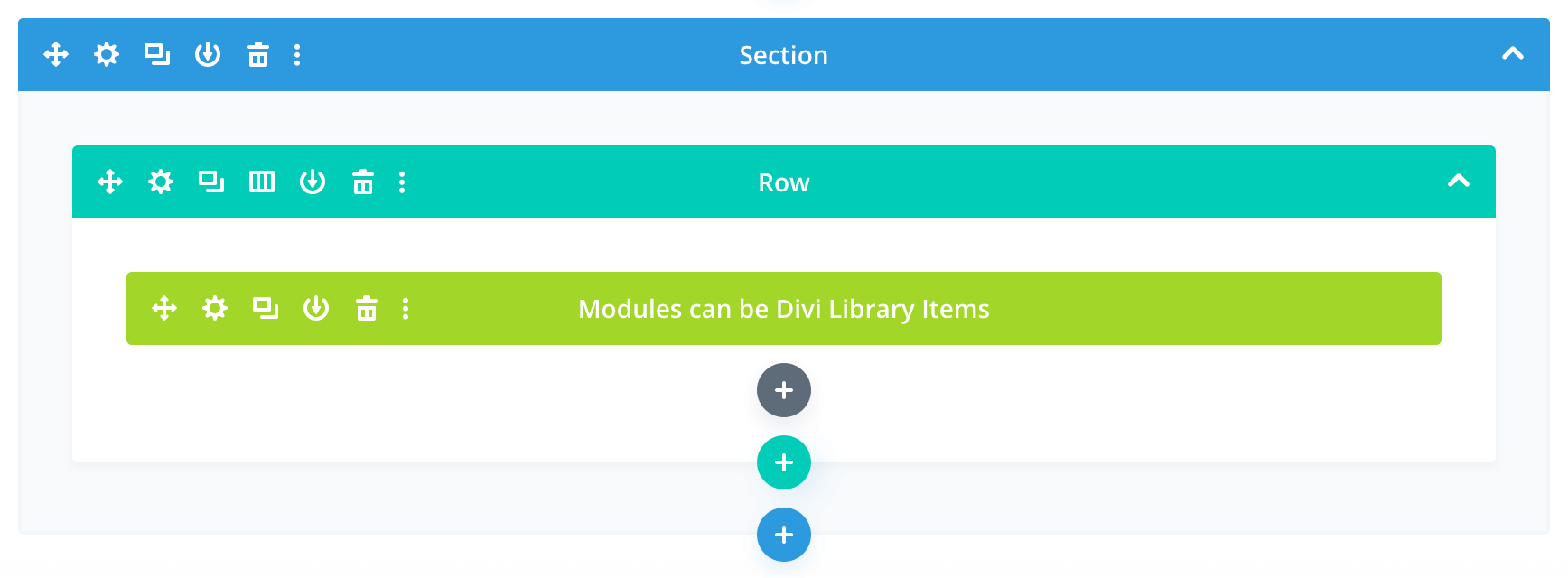
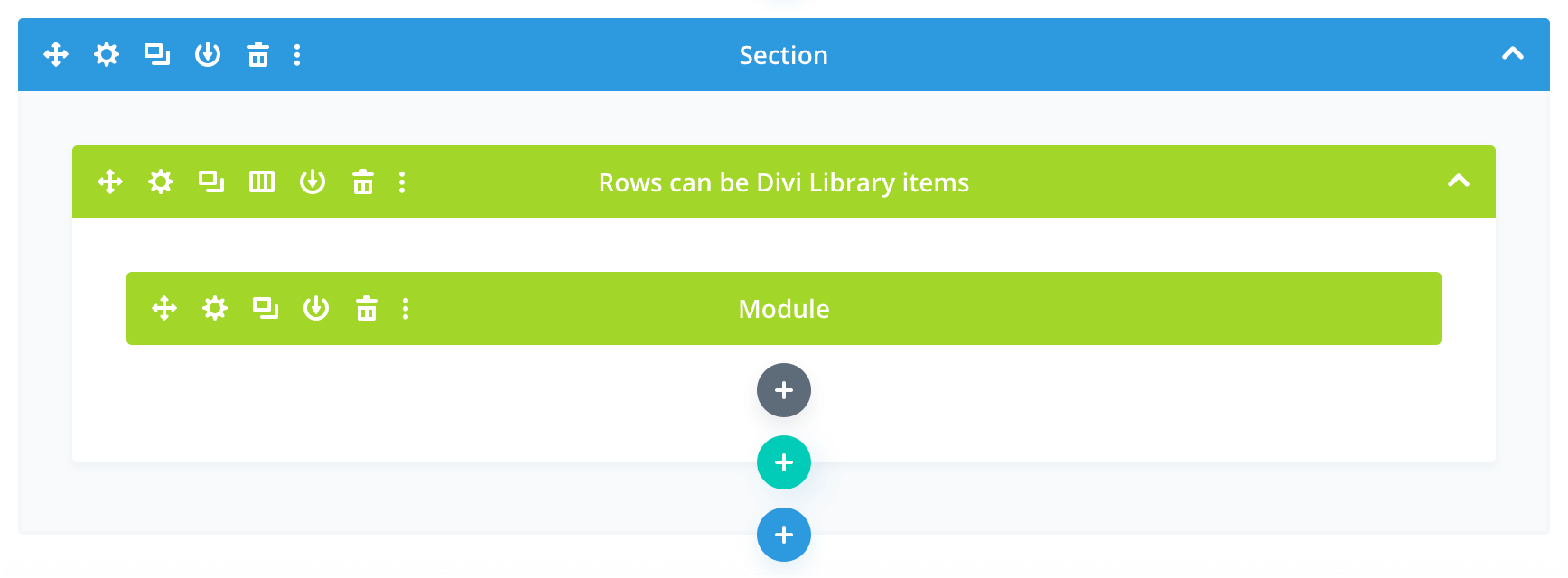
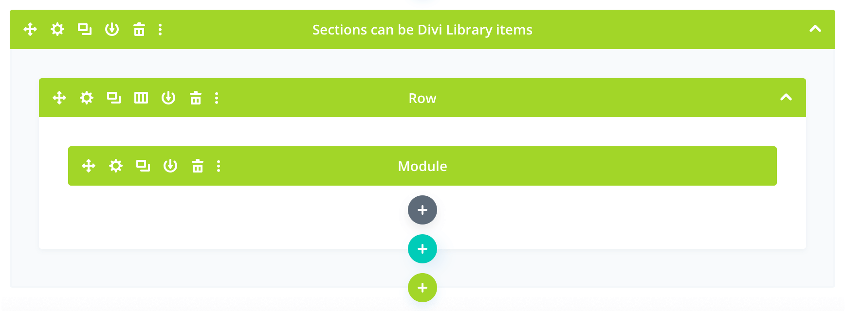
Sections, rows, and modules can all be Divi Library items, which appear in green:
Managing the Media Library
- Use the Media Library to add / update / remove media such as images and PDF documents
- when you need to update an existing image or document, make use of the Replace Media feature, rather than simply deleting the old image and adding / uploading a newer version; this way the file’s name and path will remain unchanged, and you won’t have to go into the various pieces of content throughout the site in order to update all your pointers to a newer file
- always be sure to optimize your images; I recommend using TinyPNG.com, a great free service for shrinking the file size of both PNGs and JPGs with little or no visible loss in quality
Managing Blog Posts
- the News page automatically aggregates all of the published blog posts
- creating a new blog post from scratch (go to Posts > Add New) is not recommended; rather, choose an existing post and use its Duplicate This link to create a copy, then edit that
- edit the HTML content of the Blog Post Content module; note that you can chunk your content into multiple text modules, images, etc, as needed
- change the Featured Image; ideally the featured image should be 400 pixels wide by 250 pixels tall, and be sure to use optimized images
- a blog post can be made to be ”sticky“, meaning that it will appear at the start of the list of articles on the blog page, regardless of the date it was published; go to Posts and for the chosen article select its Quick Edit link: on the far right you will see the Make this post sticky checkbox
Logo / Wordmark
Here are 3 possible uses of the logo / “Sechelt Fire Department” logo / workmark. Each one uses variations of the font face Copperplate Gothic, which is used for the website’s headings:
Option A
Option B
Option C
Design
Colours
- Light brown = #66534d = 102, 83, 77
- Brown = #37312f = 55, 49, 47
- Dark brown = #221b18 = 34, 27, 24
- Red = #e31e1e = 227, 30, 30; may be used in logo wordmark
- Dark red = #cb2112 = 203, 33, 19; used in buttons
- Light orange = #e78600 = 231, 134, 0
- Orange = #e78600 = 231, 134, 0
- Dark orange = #c77400 = 199, 116, 0
- Green = #29b04c = 41, 176, 76
- Dark green = #208c3d = 32, 140, 61
- Blue = #29b04c = 41, 176, 76
- Dark blue = #208c3d = 32, 140, 61
Fonts
- Heading font = Copperplate Gothic
- Body font = Lato